VolInsider
Sports Management Guru
- Joined
- Aug 14, 2005
- Messages
- 978
- Likes
- 13


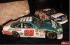
For one thing, that National Guard logo is way too big. the whole front end should be green with some color around the number some how.
The numbers should be bigger and they should not look like they came from microsoft word.
but all in all, it's ok...but I'm looking forward to the next paint scheme.
The only thing I don't care much for is the style of the number, like Crew said. Rather it be more rounded instead of squared.
")