StuckInBamaVol
Well-Known Member
- Joined
- Aug 14, 2024
- Messages
- 100
- Likes
- 178
I know it’s currently (255, 130, 0) for the current orange.
Just the 90s colors seemed much brighter colors.
Was there a difference?


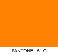
Depends on who you ask. The official line is that it's always been PMS 151.
View attachment 673845
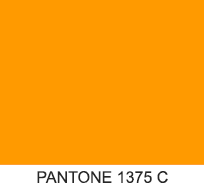
Now if you ask me, or many of my older family members, we'd swear it was closer to PMS 1375 back in the day.
View attachment 673846
However, there can be a lot of reasons to explain this. First, a lot of folks wore things for much longer back in the day, meaning fading from exposure to sunlight over time. Shirts, hats, etc., they'd all get a little washed out. Second, a lot of color reproduction was more uneven in the past, meaning you'd get more variability in shades of orange. The type of material being colored could also impact the resulting values of the print. Jersey fabric, polo fabric, t-shirts, this, that. It is painstaking to match all that, year in and year out, across all kinds of apparel and print.
That said, I'd still swear it was closer to 1375. I know, I know. The official line is 151. But 1375 has always looked more "right" to all of us. 1375 has always looked a whole lot more like the color of a daisy, too.
My personal conspiracy will always be that 151 was somehow cheaper or more readily available / standard - in some way or another it was a "better" choice - and somewhere along the way they "New Coke'd" us by switching without saying much.
On a personal note, I'm glad we're so comfortable with this week's game that we can do the "shade of orange" conversation!
Probably right.
This is serious business we are talking here.
Yeah, I ordered a Vols By Fiddy shirt, came in that garbage red orange.It is. And pennies turn into dollars and big bucks real quick, especially when you're buying in bulk.
I will say that I have lots of old Tennessee paraphenalia, things from the school (relatives who taught there), and some of printed stuff is definitely a redder orange than others. Some so red you'd say it was a Syracuse orange if you didn't know better. Print consistency has come quite a ways from back then.
I agree with you, 100%.Depends on who you ask. The official line is that it's always been PMS 151.
View attachment 673845
Now if you ask me, or many of my older family members, we'd swear it was closer to PMS 1375 back in the day.
View attachment 673846
However, there could be a lot of explanations for this perception. First, a lot of folks wore things for much longer back in the day, meaning fading from exposure to sunlight over time. Shirts, hats, etc., they'd all get a little washed out. Second, a lot of color reproduction was more uneven in the past, meaning you'd get more variability in shades of orange. The type of material being colored could also impact the resulting values of the print. Jersey fabric, polo fabric, t-shirts, this, that. It is painstaking to match all that, year in and year out, across all kinds of apparel and print.
That said, I'd still swear it was closer to 1375. I know, I know. The official line is 151. But 1375 has always looked more "right" to all of us. 1375 has always looked a whole lot more like the color of a daisy, too. That alone is why I can never shake this belief in my mind. Daisy flowers are a yellow-orange, not a slightly reddish orange. If they truly picked Tennessee's orange from the flower, then ... 1375 is closer.
My personal conspiracy will always be that 151 was somehow cheaper or more readily available / standard - in some way or another it was a "better" choice - and somewhere along the way they "New Coke'd" us by switching without saying much. If that was ever the case, it's a shame. 1375 is a far more distinct shade of orange, especially when paired with white.
I'm glad we're so comfortable with this week's game that we can do the "shade of orange" conversation!
Ha, this is probably entirely accurate.
Maybe it was just the colors on the 90s starter jackets.

 thevolunteerclub.com
Thanks for this.Depends on who you ask. The official line is that it's always been PMS 151.
View attachment 673845
Now if you ask me, or many of my older family members, we'd swear it was closer to PMS 1375 back in the day.
View attachment 673846
However, there could be a lot of explanations for this perception. First, a lot of folks wore things for much longer back in the day, meaning fading from exposure to sunlight over time. Shirts, hats, etc., they'd all get a little washed out. Second, a lot of color reproduction was more uneven in the past, meaning you'd get more variability in shades of orange. The type of material being colored could also impact the resulting values of the print. Jersey fabric, polo fabric, t-shirts, this, that. It is painstaking to match all that, year in and year out, across all kinds of apparel and print.
That said, I'd still swear it was closer to 1375. I know, I know. The official line is 151. But 1375 has always looked more "right" to all of us. 1375 has always looked a whole lot more like the color of a daisy, too. That alone is why I can never shake this belief in my mind. Daisy flowers are a yellow-orange, not a slightly reddish orange. If they truly picked Tennessee's orange from the flower, then ... 1375 is closer.
My personal conspiracy will always be that 151 was somehow cheaper or more readily available / standard - in some way or another it was a "better" choice - and somewhere along the way they "New Coke'd" us by switching without saying much. If that was ever the case, it's a shame. 1375 is a far more distinct shade of orange, especially when paired with white.
I'm glad we're so comfortable with this week's game that we can do the "shade of orange" conversation!
I don't know what number it might have been but I can assure you in the 1960s it was quite a big different than it is today. It was a softer more bleached out looking color.
View attachment 673875
It defiantly isn't the photography. If it was the crimson should be washed out too in the photo above. Besides I was at many of the games and was occasionally very close to some of the players. Tennessee orange was as dear to the fans back then is it is to fans today.It was. Some try to say that the orange looks ”washed out” because of photography, but that’s not it. Or rather, I reject that explanation. My memories match yours. UT orange was a lighter and more yellow shade of orange in the past.
And that is how it looked in person.I don't know what number it might have been but I can assure you in the 1960s it was quite a bit different than it is today. It was a softer more bleached out looking color.
View attachment 673875
For even further conversation, was the fruit named after the color; or the color named after the fruit?Depends on who you ask. The official line is that it's always been PMS 151.
View attachment 673845
Now if you ask me, or many of my older family members, we'd swear it was closer to PMS 1375 back in the day.
View attachment 673846
However, there could be a lot of explanations for this perception. First, a lot of folks wore things for much longer back in the day, meaning fading from exposure to sunlight over time. Shirts, hats, etc., they'd all get a little washed out. Second, a lot of color reproduction was more uneven in the past, meaning you'd get more variability in shades of orange. The type of material being colored could also impact the resulting values of the print. Jersey fabric, polo fabric, t-shirts, this, that. It is painstaking to match all that, year in and year out, across all kinds of apparel and print.
That said, I'd still swear it was closer to 1375. I know, I know. The official line is 151. But 1375 has always looked more "right" to all of us. 1375 has always looked a whole lot more like the color of a daisy, too. That alone is why I can never shake this belief in my mind. Daisy flowers are a yellow-orange, not a slightly reddish orange. If they truly picked Tennessee's orange from the flower, then ... 1375 is closer.
My personal conspiracy will always be that 151 was somehow cheaper or more readily available / standard - in some way or another it was a "better" choice - and somewhere along the way they "New Coke'd" us by switching without saying much. If that was ever the case, it's a shame. 1375 is a far more distinct shade of orange, especially when paired with white.
I'm glad we're so comfortable with this week's game that we can do the "shade of orange" conversation!
