1985volunteer
Well-Known Member
- Joined
- Oct 15, 2016
- Messages
- 50
- Likes
- 165
The people demand answers!Any decision to change the shade of orange on uniforms would give primary consideration to how the color appeared on TV. That was how they tested it back in the mid-late '60s (IIRC) when color TVs began to outnumber b&w TVs.
So I wonder if when LCD and plasma screens became predominant, if they revisited the issue?
Any change of uni designer/supplier would also require a re-test, both for the material and for its texture on TV.
There's an inside-the-UTAD documentary waiting to be made! I think all an independent director needs is an agreement with UT to promote it, package it with other video packages, or monetize it on streaming services. How about SEC Network making a bid? Let's get some backing money flowing!
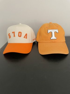
I am 85 years old and have worn orange “Tennessee “ clothes for at least eighty of those years. 151 c is as about as far away from Tennessee Orange as one can get. While 1375 c is closer, it is still too reddish and no where near the wild daisy yellow which grew on “The Hill”.Depends on who you ask. The official line is that it's always been PMS 151.
View attachment 673845
Now if you ask me, or many of my older family members, we'd swear it was closer to PMS 1375 back in the day.
View attachment 673846
However, there could be a lot of explanations for this perception. First, a lot of folks wore things for much longer back in the day, meaning fading from exposure to sunlight over time. Shirts, hats, etc., they'd all get a little washed out. Second, a lot of color reproduction was more uneven in the past, meaning you'd get more variability in shades of orange. The type of material being colored could also impact the resulting values of the print. Jersey fabric, polo fabric, t-shirts, this, that. It is painstaking to match all that, year in and year out, across all kinds of apparel and print.
That said, I'd still swear it was closer to 1375. I know, I know. The official line is 151. But 1375 has always looked more "right" to all of us. 1375 has always looked a whole lot more like the color of a daisy, too. That alone is why I can never shake this belief in my mind. Daisy flowers are a yellow-orange, not a slightly reddish orange. If they truly picked Tennessee's orange from the flower, then ... 1375 is closer.
My personal conspiracy will always be that 151 was somehow cheaper or more readily available / standard - in some way or another it was a "better" choice - and somewhere along the way they "New Coke'd" us by switching without saying much. If that was ever the case, it's a shame. 1375 is a far more distinct shade of orange, especially when paired with white.
I'm glad we're so comfortable with this week's game that we can do the "shade of orange" conversation!
I've still got several items from the 90's (including an Adidas hat autographed by Johnny Majors) and they are noticeably lighter than than 151c, and not due to just fading.Depends on who you ask. The official line is that it's always been PMS 151.
View attachment 673845
Now if you ask me, or many of my older family members, we'd swear it was closer to PMS 1375 back in the day.
View attachment 673846
However, there could be a lot of explanations for this perception. First, a lot of folks wore things for much longer back in the day, meaning fading from exposure to sunlight over time. Shirts, hats, etc., they'd all get a little washed out. Second, a lot of color reproduction was more uneven in the past, meaning you'd get more variability in shades of orange. The type of material being colored could also impact the resulting values of the print. Jersey fabric, polo fabric, t-shirts, this, that. It is painstaking to match all that, year in and year out, across all kinds of apparel and print.
That said, I'd still swear it was closer to 1375. I know, I know. The official line is 151. But 1375 has always looked more "right" to all of us. 1375 has always looked a whole lot more like the color of a daisy, too. That alone is why I can never shake this belief in my mind. Daisy flowers are a yellow-orange, not a slightly reddish orange. If they truly picked Tennessee's orange from the flower, then ... 1375 is closer.
My personal conspiracy will always be that 151 was somehow cheaper or more readily available / standard - in some way or another it was a "better" choice - and somewhere along the way they "New Coke'd" us by switching without saying much. If that was ever the case, it's a shame. 1375 is a far more distinct shade of orange, especially when paired with white.
I'm glad we're so comfortable with this week's game that we can do the "shade of orange" conversation!
1375 all dayDepends on who you ask. The official line is that it's always been PMS 151.
View attachment 673845
Now if you ask me, or many of my older family members, we'd swear it was closer to PMS 1375 back in the day.
View attachment 673846
However, there could be a lot of explanations for this perception. First, a lot of folks wore things for much longer back in the day, meaning fading from exposure to sunlight over time. Shirts, hats, etc., they'd all get a little washed out. Second, a lot of color reproduction was more uneven in the past, meaning you'd get more variability in shades of orange. The type of material being colored could also impact the resulting values of the print. Jersey fabric, polo fabric, t-shirts, this, that. It is painstaking to match all that, year in and year out, across all kinds of apparel and print.
That said, I'd still swear it was closer to 1375. I know, I know. The official line is 151. But 1375 has always looked more "right" to all of us. 1375 has always looked a whole lot more like the color of a daisy, too. That alone is why I can never shake this belief in my mind. Daisy flowers are a yellow-orange, not a slightly reddish orange. If they truly picked Tennessee's orange from the flower, then ... 1375 is closer.
My personal conspiracy will always be that 151 was somehow cheaper or more readily available / standard - in some way or another it was a "better" choice - and somewhere along the way they "New Coke'd" us by switching without saying much. If that was ever the case, it's a shame. 1375 is a far more distinct shade of orange, especially when paired with white.
I'm glad we're so comfortable with this week's game that we can do the "shade of orange" conversation!
Yep that was the Tennessee orange in the 60s! Would be awesome to see Vols-Bama square off in crimson and orange.I don't know what number it might have been but I can assure you in the 1960s it was quite a bit different than it is today. It was a softer more bleached out looking color.
View attachment 673875