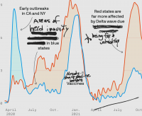
It’s an interesting graphic, but it looks like a classic opinion shaping piece. It’s missing some important context like:
- How was excess death defined?
- What is the source of the data and was it gathered and measured in a consistent way across states and across time?
- Why was the 15% criteria chosen? Is there a significant difference if you cut that off at 10%, for example?
Did all of the states in each grouping enact the same type of lockdown measures? It seems to be the most logical grouping would not be red / blue states, but states that had similar lockdown / masking measures. The timing would also be a factor.
The most egregious error is Axios drew conclusions from this and then try to pass it off as fact. This is not how “the science” works.
If the creator set out to support a predetermined conclusion, this type of evidence is pretty easy to generate by selecting the parameters that produce the most compelling graphic. It’s not the science many of the readers probably believe it to be. It’s just opinion shaping.


