Power T-Rev
Tennessee is bad for your health
- Joined
- Jan 16, 2011
- Messages
- 14,380
- Likes
- 19,745
If the vaccine works as it is intended, then the only people that are put at risk are the anti-vaxxers, correct?
Rasputin_Vol, what you quote was what Ktown Vol had said. Yes I know covid is real but those numbers are in no way correct. There are way to many examples of people dying of something else but their cause of death is listed as covid. We will never know the true number but it is nowhere near that number at this time.
I would very much like to see that stat, because just off the top of my head, I bet you deaths from the seasonal flu and car accidents were lower during the lockdown.During the lockdown months deaths of all causes increased by nearly 20% even after taking out the reported COVID deaths. This leads scientists to believe the COVID deaths are being grossly undercounted.
I would very much like to see that stat, because just off the top of my head, I bet you deaths from the seasonal flu and car accidents were lower during the lockdown.
The reason I believe this is because three of my most repected minds of today said that that number needs to be reduced by a factor of 10. I'll trust the people who have triple digit IQs and not the media who is filled with, well, dumb people.When a guy in Florida dies in a motorcycle crash but his cause of death is listed a Covid-19 that throws all credibility out the window to their numbers. So many people have died and listed as a covid death that actually died from something else. There is no truth in the covid death numbers.
Well that and Florida spent a few days reducing some of their daily totals by quite literally a factor of 10.The reason I believe this is because three of my most repected minds of today said that that number needs to be reduced by a factor of 10. I'll trust the people who have triple digit IQs and not the media who is filled with, well, dumb people.
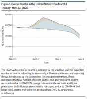
OK, I just saw the data you posted. The graph below shows their findings. The top solid line represents the actual observed number of deaths. This is a hard number not open to estimates or Poisson regression models. The dotted dashed line represents the "expected" number of deaths. Now here is where the math trickeration begins because now they are adjusting for "seasonality, influenza and reporting delays". Those three items are openings for errors or manipulation, they are a few steps above just pulling numbers out of thin air. The area in the graph where you see the peak in "excess deaths" looks to have occurred around early April. Judging from the scaling of the chart, the band between the Orange area and the solid black line at the peak looks like about 5k "excess deaths"... maybe. From the rest of the graph, it appears that actual deaths (solid black line) and "excess deaths" (area between Orange and solid black line) are pretty much tracking each other perfectly. So even if we assume this model is correct with the assumptions they made, between late March and late April, we could be maybe (maybe) looking at 15k more excess deaths.During the lockdown months deaths of all causes increased by nearly 20% even after taking out the reported COVID deaths. This leads scientists to believe the COVID deaths are being grossly undercounted.

OK, I just saw the data you posted. The graph below shows their findings. The top solid line represents the actual observed number of deaths. This is a hard number not open to estimates or Poisson regression models. The dotted dashed line represents the "expected" number of deaths. Now here is where the math trickeration begins because now they are adjusting for "seasonality, influenza and reporting delays". Those three items are openings for errors or manipulation, they are a few steps above just pulling numbers out of thin air. The area in the graph where you see the peak in "excess deaths" looks to have occurred around early April. Judging from the scaling of the chart, the band between the Orange area and the solid black line at the peak looks like about 5k "excess deaths"... maybe. From the rest of the graph, it appears that actual deaths (solid black line) and "excess deaths" (area between Orange and solid black line) are pretty much tracking each other perfectly. So even if we assume this model is correct with the assumptions they made, between late March and late April, we could be maybe (maybe) looking at 15k more excess deaths.
The picture that these people want to present is that a majority of these excess deaths are COVID, yet, they could just as easily be natural death or other causes. Propaganda used to pump up the COVID deaths. What they won't say is that there is a very good chance that we have just as easily overcounted for COVID instead of undercounted.
View attachment 298304
My issue was with what you had said in your original post...I believe the methodology is the same used to calculate flu deaths during any given year.
What is in it for Drs to create hysteria? Hospitals are bleeding money right now despite the extra cash the CARES Act allocated for COVID treatment.
During the lockdown months deaths of all causes increased by nearly 20% even after taking out the reported COVID deaths. This leads scientists to believe the COVID deaths are being grossly undercounted.
