You are using an out of date browser. It may not display this or other websites correctly.
You should upgrade or use an alternative browser.
You should upgrade or use an alternative browser.
Uniform/Helmet/Shoe design thread (merged)
- Thread starter Vol865
- Start date
YankeeVol
Bestest Member
- Joined
- Mar 11, 2010
- Messages
- 141,178
- Likes
- 70,433
NeverWe'llSever
NashVol
- Joined
- Apr 22, 2016
- Messages
- 5,661
- Likes
- 13,159
peaygolf
The "Fly" is open.....Let's Go Peay!!!!
- Joined
- Nov 30, 2017
- Messages
- 25,214
- Likes
- 120,273
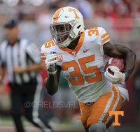
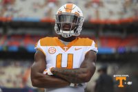
Orange pants are fine by me, especially if we wear them against Bama. But NO GREY OUTLINE, get rid of the orange collar and use block font. As for stripes on the pants, I’m cool either way.
View attachment 196011
DeerPark12
Well-Known Member
- Joined
- Mar 25, 2009
- Messages
- 7,238
- Likes
- 11,618
And not football related but since DP is here, is the basketball team getting orange versions of the white throwbacks? Because it's pretty clear those are going to be the fulltime home uniforms from now on and it looks kind of weird seeing the "new" orange ones now.
Personally I'm fine with the football and basketball teams (both men and women's) going with simply orange and white only, and leave the smokey grey for the other teams. I get why the baseball and softball teams would want them because they play more games and probably need more variety.
Not at this point. Both the men’s and women’s teams are due for a total remake next year, but it’ll feature the same newer wordmark and font.
The throwbacks were a Nike thing this year. UT got theirs a month earlier than everyone else, but it was a multi-school program.
SayNoToJorts
Well-Known Member
- Joined
- Jun 12, 2012
- Messages
- 1,566
- Likes
- 3,588
Black is not currently part of the Nike/Tennessee approved color pallete and cannot appear on a game uniform. Smokey Grey is the “dark” color used for outlines on other UT jerseys, including men’s and women’s basketball, baseball and softball.
You know better than I do but could they not just add black back to the color pallete? Just seems like the momentum of the uniforms style is headed back toward the Fulmer years and that would be an easy fix
SpookyAction
Well-Known Member
- Joined
- Jan 3, 2019
- Messages
- 3,787
- Likes
- 6,964
BigOrange15
Never Falter, Never Yield
- Joined
- Nov 3, 2009
- Messages
- 22,912
- Likes
- 34,914
Lots of "Vault" type fan apparel this year too. Good times if you are fan of the Vols star logo (which I am) and others.Not at this point. Both the men’s and women’s teams are due for a total remake next year, but it’ll feature the same newer wordmark and font.
The throwbacks were a Nike thing this year. UT got theirs a month earlier than everyone else, but it was a multi-school program.
- Joined
- Mar 23, 2011
- Messages
- 28,276
- Likes
- 27,055
I've always wondered who it was that had trouble seeing orange numbers. I hear people complain about it, but I've never had the slightest issue seeing them.
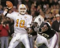
Back in the 90's UT's uniforms were made by SportsBell (I believe). The jerseys were "mesh" and the UT orange screening was a large font with a tiny white space with orange trim. I always heard the announcers couldn't see the numbers. Here's the 1994 UGA before they added the black trim for the S. Carolina game.
- Joined
- Mar 23, 2011
- Messages
- 28,276
- Likes
- 27,055
Roustabout
Well-Known Member
- Joined
- Aug 11, 2010
- Messages
- 18,028
- Likes
- 15,400
Might explain why Will Muschamp hates UT. He was playing that day and got snow plowed.Back in the 90's UT's uniforms were made by SportsBell (I believe). The jerseys were "mesh" and the UT orange screening was a large font with a tiny white space with orange trim. I always heard the announcers couldn't see the numbers. Here's the 1994 UGA before they added the black trim for the S. Carolina game.
I remember that game vividly. I had just helped my girlfriend (now wife) move and told her we had to be done in time for the game.
rocktopper16
Spread sunshine, Not shade.
- Joined
- Jan 8, 2012
- Messages
- 11,692
- Likes
- 10,406
05_never_again
Well-Known Member
- Joined
- Aug 28, 2006
- Messages
- 24,483
- Likes
- 22,401
Back in the 90's UT's uniforms were made by SportsBell (I believe). The jerseys were "mesh" and the UT orange screening was a large font with a tiny white space with orange trim. I always heard the announcers couldn't see the numbers. Here's the 1994 UGA before they added the black trim for the S. Carolina game.
That's what that SB stood for? I know SB was the manufacturer of the jerseys, but never knew what it stood for.
Brave Volunteer
Well-Known Member
- Joined
- Nov 8, 2006
- Messages
- 18,337
- Likes
- 22,005
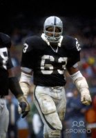
I’m older and showing my age, but I miss the longer sleeves a neck rolls..........View attachment 195976View attachment 195977
I always thought neckrolls looked badass. Especially the ones that came to a point at each end.
I miss the days when football players looked like this...
Attachments
peaygolf
The "Fly" is open.....Let's Go Peay!!!!
- Joined
- Nov 30, 2017
- Messages
- 25,214
- Likes
- 120,273
SpookyAction
Well-Known Member
- Joined
- Jan 3, 2019
- Messages
- 3,787
- Likes
- 6,964
RDU VOL#14
I’m a Flawed Character
- Joined
- Sep 11, 2007
- Messages
- 25,880
- Likes
- 38,341
Behr
VOLS BY FIDDIOT!!!
- Joined
- Aug 7, 2009
- Messages
- 127,676
- Likes
- 174,306
peaygolf
The "Fly" is open.....Let's Go Peay!!!!
- Joined
- Nov 30, 2017
- Messages
- 25,214
- Likes
- 120,273
pismonque
Bury me in Orcadian peat
- Joined
- Aug 4, 2009
- Messages
- 5,529
- Likes
- 13,247
RDU VOL#14
I’m a Flawed Character
- Joined
- Sep 11, 2007
- Messages
- 25,880
- Likes
- 38,341
Behr
VOLS BY FIDDIOT!!!
- Joined
- Aug 7, 2009
- Messages
- 127,676
- Likes
- 174,306
peaygolf
The "Fly" is open.....Let's Go Peay!!!!
- Joined
- Nov 30, 2017
- Messages
- 25,214
- Likes
- 120,273
Behr
VOLS BY FIDDIOT!!!
- Joined
- Aug 7, 2009
- Messages
- 127,676
- Likes
- 174,306


