Uniform/Helmet/Shoe design thread (merged)

It was my understanding that it wasn’t supposed to be an oval patch but just the 150 and football just so it wouldn’t take so much space up. And it was supposed to go above the SEC logo.

View attachment 213584

I asked my sources around the equipment room. In those photos, the conference logos have been photoshopped to be smaller and lower down than they actually are and the 150 easily fits on top.

UT, like most Nike schools, has Nike put on the SEC patch before the jerseys are shipped. They already had the order in when the 150 patch was made a requirement. So the jerseys shipped and putting the 150 patch over the SEC would have put it at an awkward place based on where the shoulder pads lay on the player. So they elected to put it above the swoosh for a better fit. Had they known about the patch before the order, they would have applied the SEC patch themselves a little lower, like they did the year we played in the CFA kickoff game.
 
  • Like
Reactions: cHiZzLeVOL
I asked my sources around the equipment room. In those photos, the conference logos have been photoshopped to be smaller and lower down than they actually are and the 150 easily fits on top.

UT, like most Nike schools, has Nike put on the SEC patch before the jerseys are shipped. They already had the order in when the 150 patch was made a requirement. So the jerseys shipped and putting the 150 patch over the SEC would have put it at an awkward place based on where the shoulder pads lay on the player. So they elected to put it above the swoosh for a better fit. Had they known about the patch before the order, they would have applied the SEC patch themselves a little lower, like they did the year we played in the CFA kickoff game.

Dang NCAA ruining things. Thanks, makes sense.
 
We finally got to put out the shoes yesterday and honestly, they are my favorite UT branded Nike shoe so far in terms of aesthetics. They are a little more understated than in years past which is a good thing if you are looking to wear them with non-gameday attire. I actually like them quite a bit now that I've seen them in person. Also, they are running shoes instead of training shoes so they are much more comfortable imo.
 
Our orange is very reactive to light in photos, based on the material. Laid out on a table in the equipment room, every piece of that Patterson uniform and helmet had matching oranges. Put under stadium lights and photographed, it's a hodgepodge. The numbers were a twill that was a little reflective under the lights. The helmet decal was shiny. The pant strips were a matte finish. Nike is a little closer because they use a matte fabric for the trim and the numbers, but the helmet decals will always look a little off under the lights.

It's the biggest reason we don't have an orange alt helmet. A dozen samples have come through that all end up clashing under one light or another.

I would still like to see one, even if it's one game and only lasts one season. I generally give a little leeway when it comes to helmets since many teams seem to have issues or just concede they won't match exactly. For example, I think the Los Angeles Rams' classic blue and yellow uniforms are some of the best in football, but the helmet blue doesn't match the jersey blue. And it's been that way forever, even back before they moved to St. Louis.
 
So looks like we are practicing with the solid white pants from last year as opposed to the checker-striped Butch-era pants. Could this mean double-stripes making a comeback?
 
  • Like
Reactions: RDU VOL#14
So looks like we are practicing with the solid white pants from last year as opposed to the checker-striped Butch-era pants. Could this mean double-stripes making a comeback?

Don't they just use the previous' seasons uniforms for practice the next year? The pants at least.
 
I asked my sources around the equipment room. In those photos, the conference logos have been photoshopped to be smaller and lower down than they actually are and the 150 easily fits on top.

UT, like most Nike schools, has Nike put on the SEC patch before the jerseys are shipped. They already had the order in when the 150 patch was made a requirement. So the jerseys shipped and putting the 150 patch over the SEC would have put it at an awkward place based on where the shoulder pads lay on the player. So they elected to put it above the swoosh for a better fit. Had they known about the patch before the order, they would have applied the SEC patch themselves a little lower, like they did the year we played in the CFA kickoff game.
Will jerseys with the 150 year patch be sold at all?
 
Here's a shot of the orange pants that you probably won't see on the field this year:


Is it too much to ask for stripes on the freaking pants or maybe rock the orange pants every now and then? Our uniforms are basically Orange and white version of Penn State now.
 
It would be great if Nike could use some R & D to find material that would allow every ounce of Orange on the uni to match. But maybe this is impossible. Bama can't seem to get its helmets and jerseys to match and the Wisconsin Motion W has always had a different shade of red than the rest of their uni. Out here in Cali, there's always a discussion on what shade of blue UCLA will don for the season as it tends to change yearly.
 
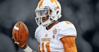
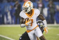
Is it just me or does the Orange jerseys look more reddish orange than VOLS orange? Also the helmet "T" looks smaller and higher up on the helmet than years past imo.
 
  • Like
Reactions: Steven5198
The Power T got slightly smaller 4-5 years ago, or somewhere around there.

Yeah, you can thank Nike for creating the smaller and slightly narrower upper part of the Power T in 2015. Same deal with any of the Nike apparel. Just compare any of it with the apparel from pre 2015. It's subtle, but it's there, and it was 100 percent Nike. I believe it was even documented in one of their releases. It was a completely unnecessary change. The Power T had been untouched for decades (Other than made slightly thicker sometime in the 80's-90's.) Nike will NEVER leave things like that alone when you first allow their foot in the door. It's part of doing business with them...
 
Last edited:
  • Like
Reactions: YankeeVol
Yeah, you can thank Nike for creating the smaller and slightly narrower upper part of the Power T in 2015. Same deal with any of the Nike apparel. Just compare any of it with the apparel from pre 2015. It's subtle, but it's there, and it was 100 percent Nike. I believe it was even documented in one of their releases. It was a completely unnecessary change. The Power T had been untouched for decades (Other than made slightly thicker sometime in the 80's-90's.) Nike will NEVER leave things like that alone when you first allow their foot in the door. It's part of doing business with them...

The change on uniforms and apparel coincided with the switch to Nike, but Tennessee actually began using the "new" T on documents, publications and facilities in 2014, the year before the Nike switch.

It was done for consistency in branding. The previous T was wider than it was tall. When the logo was resized by vendors and in print, the aspect ratio was often distorted. By making it a perfect square, those problems were ended. It wasn't change for the sake of change, as you suggested, there was a very purposeful reason behind it.
 
  • Like
Reactions: kcvols1 and illvol
So, technology gets better with time and all of a sudden graphic designers have more difficulty resizing files with their crazy paint programs? Makes sense. Lol!!

I don't care what the ridiculous reason is. UT can spin it how they want. Just like how they spun the adding of the gray to color pallet. (I actually like the gray.) The REASON the "Power T" was unique was because of it's proportions! The top was "beefier"/emphasized for a reason. All UT did/allowed to happen was change a unique logo to a regular sized letter in a different font. Period.

By the way, the letter is still smaller, in OVERALL size, on the helmets than the pre Nike era. Regardless of proportions. That's something that's been happening in football with SOME programs over the past several years. I'd imagine that SOME of it is trying to fit the decals on certain panels/sections of the newer helmet models (The helmets are not smaller in size. They're just contoured and shaped differently) and Tennessee just got sucked into it. If that's the case, then it's just a lazy solution rather than making the old size logos work on the new helmets.

Regardless. Is it a coincidence that the overall resizing on the helmets all of a sudden happened, with Tennessee, at the same time as the Nike change in 2015????? I'll let common sense answer that one. Most people that notice it thinks it makes the helmet look MUCH inferior to the previous version. That's the whole reason someone started this thread...

By the way, I don't necessarily and completely dislike the new Power T. Just trying to explain that it's pure LAZINESS if the reason you stated is the true reason. Make vendors, contractors, etc adjust to YOUR brand. Not the other way around. If they screw it up trying to duplicate it, then sorry. Go back and do it until you get it right if you want the business from Tennessee. Logos, branding, marketing is there for a reason. Tennessee just let someone else tell them what to do solve a "problem". Rather than the opposite. Sad...

2014:
vols5432.jpg


2015: MUCH smaller in overall size. Looks much more inferior, in my opinion, too.
5b09fbf7e967fb04e67cc44e8c2e9875_crop_exact.jpg
 
Last edited:
So, technology gets better with time and all of a sudden graphic designers have more difficulty resizing files with their crazy paint programs? Makes sense. Lol!!

I don't care what the ridiculous reason is. UT can spin it how they want. Just like how they spun the adding of the gray to color pallet. (I actually like the gray.) The REASON the "Power T" was unique was because of it's proportions! The top was "beefier"/emphasized for a reason. All UT did/allowed to happen was change a unique logo to a regular sized letter in a different font. Period.

By the way, the letter is still smaller, in OVERALL size, on the helmets than the pre Nike era. Regardless of proportions. That's something that's been happening in football with SOME programs over the past several years. I'd imagine that SOME of it is trying to fit the decals on certain panels/sections of the newer helmet models (The helmets are not smaller in size. They're just contoured and shaped differently) and Tennessee just got sucked into it. If that's the case, then it's just a lazy solution rather than making the old size logos work on the new helmets.

Regardless. Is it a coincidence that the overall resizing on the helmets all of a sudden happened, with Tennessee, at the same time as the Nike change in 2015????? I'll let common sense answer that one. Most people that notice it thinks it makes the helmet look MUCH inferior to the previous version. That's the whole reason someone started this thread...

By the way, I don't necessarily and completely dislike the new Power T. Just trying to explain that it's pure LAZINESS if the reason you stated is the true reason. Make vendors, contractors, etc adjust to YOUR brand. Not the other way around. If they screw it up trying to duplicate it, then sorry. Go back and do it until you get it right if you want the business from Tennessee. Logos, branding, marketing is there for a reason. Tennessee just let someone else tell them what to do solve a "problem". Rather than the opposite. Sad...

2014:
View attachment 225438


2015: MUCH smaller in overall size. Looks much more inferior, in my opinion, too.
View attachment 225439
I agree the T on our helmets has become smaller and I'm not a fan of it
 
  • Like
Reactions: Steven5198
Doubtful, I think they sold all the helmets for charity of something.

I wish we would wear all orange, thats my favorite ever. But I liked the grey too
 
  • Like
Reactions: VOLfrombama

VN Store


Back
Top