Shrimp&Grits&Vols
Well-Known Member
- Joined
- Oct 13, 2023
- Messages
- 81
- Likes
- 156
Ole Miss would have been formidable if they had used Col Reb and not that weird script name thing
They tried that a few years ago. It was universally panned. Nobody liked the change, so it went back where it should be. The "Lady Vols" Is an iconic brand of its ownSpeaking of old and script, the women's program needs to ditch that ancient and very outdated "Lady Vols" logo. It's terrible--weak-looking.
I think we're the only school in America that has still has separate logos for the men's and women's teams. The Power T is sometimes used by media and others schools who are playing our women's teams, thankfully--but it's basically about people who continue to want to hang onto the Pat Summitt era. They can't move on....The difference between the Power T and the LV logo is the difference between strong and anemic.
Yeah, Dave Hart and Jimmy Cheek discontinued the Lady Vol logo and name for all sports but women's basketball. Most likely they did it out of spite for the lawsuits some of the former women's athletic department employees had filed against the school. They knew they didn't have the juice to screw with Summit's legacy and left it alone in basketball.They tried that a few years ago. It was universally panned. Nobody liked the change, so it went back where it should be. The "Lady Vols" Is an iconic brand of its own
Always liked the rifleman logo.
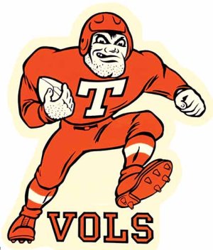
Gotta admit though, the design could possibly use a bit of updating. Never really noticed before how dated it looks now-straight outta 1974
Also not sure how it would look on a helmet. There is quite a bit of detail in there (tassels, etc) which would be lost in shrinking the design down.