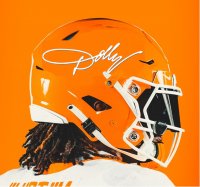
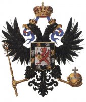
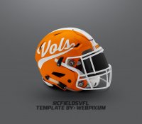
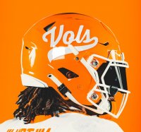
Favorite Alternative Orange Helmet Logo?

#51
#51
Love the rifleman! But would never be allowed. It’s intimidating. I was told This is why the National guard had to change their logo from the man holding a rifle & plow. Someone said it was intimidating & they weren’t comfortable with it, so it was changed a couple of years ago to the star
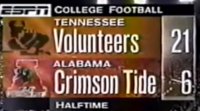
Screenshot_20221118-145028_YouTube.jpgI wish they would bring this icon back next to the name Tennessee on tv.
 
#53
#53
Love the rifleman! But would never be allowed. It’s intimidating. I was told This is why the National guard had to change their logo from the man holding a rifle & plow. Someone said it was intimidating & they weren’t comfortable with it, so it was changed a couple of years ago to the star
Not sure if you are missing blue font, but that it completely false.

“The Minuteman logo is still being used,” he said. “It’s the National Guard seal.”
Instead, Parmer said the new logo being replaced is an older recruiting logo that features “National Guard” in red letters with a stylized American flag.
The new logo will better integrate the Guard’s recruiting efforts with the larger Army, he said.
“There has been some confusion with previous brandings,” Parmer said, noting that the logo has not always readily identified the Guard as part of the Army’s Total Force.
 
#55
#55
I like the interlocking UT, the Vols script, the Power T, and do not like the three stars. I love the Vols script. I would have thought I would like the 3 stars before I saw them. I like the Rifleman, but it would not be discernible from a distance. People would be squinting to make out what it is. Besides, as others have pointed out, having a rifle on a helmet would make the woke crowd have a nuclear explosion of virtue signaling.
 
  • Like
Reactions: VolPack22
#59
#59
dec0383b-44de-40d5-9c82-86894493f0dd-jpeg.515506
 
#64
#64
Not sure if you are missing blue font, but that it completely false.

“The Minuteman logo is still being used,” he said. “It’s the National Guard seal.”
Instead, Parmer said the new logo being replaced is an older recruiting logo that features “National Guard” in red letters with a stylized American flag.
The new logo will better integrate the Guard’s recruiting efforts with the larger Army, he said.
“There has been some confusion with previous brandings,” Parmer said, noting that the logo has not always readily identified the Guard as part of the Army’s Total Force.


National Guard Changes Logo Due to Failure of American Education System | Small Wars Journal
 
#65
#65
I like all of them.
So, I would let each player choose which one they want on one side of the helmet.
The other side should have the Power T on all helmets.
 
  • Like
Reactions: MAD
#75
#75
Bama’s logo is theb”A” and it’s not on their helmet. I’m for any tasteful creativity that keeps it fresh and still Embraces tradition.

Alabama’s tradition is their logo has never been on their helmets. Only the number. The Power T is Tennessee. Has been the only item on the helmet.
 

VN Store


Back
Top