Latest Coronavirus - Yikes

they've moved on from it....you should too. There are four strains of this virus. Not sure which strain it could work against. There is not enough testing to get early treatment going.
And that’s why there’s no point in us waiting for a vaccine. This thing will mutate and be similar to the flu. Additional strains will develop so there’s not going to a magic shot that makes it go away.
 
  • Like
Reactions: 508mikey
Okay? What's your point? Are you saying my opinion is incorrect? That's fine if it is, but why do you think "meat plants are being hit hard and not other manufacturing businesses?" That was the question I answered that no one else had in 3 pages.

Now your the third person arguing against me and all I've seen is because of illegal immigrants working there and living together under one roof.

Are there more illegal immigrants working in the meat packing plants than other manufacturing businesses?
Yes, allegedly.
 
How much?

If you let the virus just keep running in exponential mode, you keep doubling about every 3 days until you reach peak active cases and then you start falling off - that peak is related to the R0. So if R0 is around 2.5 (this roughly corresponds to doubling every 3 days), you'd expect to peak in active cases when you reach about 40% of the population without infection (or 60% infected). This comes from simple SIR viral models, so isn't exact, but gives a measure of how her immunity progresses.

So, the question is can we see the effects of our social distancing efforts? Can we see that we slow the spread? What follows is a lengthy post. Lots of math. I wrote this on another board to counter an argument made by someone who claimed that the peak New York deaths came too early for the lockdown to be the reason. So you'll see me referring to "the author" below. I just wanted to clarify that's what I meant by "the author" when I refer to his argument.

--------------------------------

The executive summary of the long piece below is this: Slowing the spread doesn't mean new cases/day don't continue rising (and thus new deaths per day). In exponential growth, the change in new cases/day from day 2 to day 3 is bigger than the change from day 1 to day 2. It is running away. In the post below I lay out how you can see the change in New York mobility/contact is well-correlated to when we started seeing the change in new deaths/day trajectory. Note that the author of the original piece assumed 5 days of incubation (this is a good assumption and is the accepted median incubation time) and about 15 days between becoming symptomatic and death (also doesn't seem to be a bad assumption - I've seen 15-17 days in several studies).

------------------------------------------------------

If we go look at New York data, you can see the impacts of social distancing. First, I think that using the lockdown date is not a good approximation of when what causes a change in the rate of spread. You are really looking for where behavior started changing that might affect the new cases/day. And while a lockdown might be necessary to drive contact to an even lower value, Americans' behavior started changing before lockdowns began (for reference, the first full day of the NY Safer at Home Pause was March 23).

For example, here is NY mobility data (from unacast, using cell phone data):

New York Mobility Data.PNG

We can see the first day that we saw a big drop in the mobility was March 12th (this is quite consistent across the country...it was when a lot of cancellations happened in sports and people really started changing behavior. This was the week that the headlines out of Italy started sounding very bad.

When you drop contact, it doesn't mean less people are infected the next day. With constant exponential growth the doubling time is reduced by contact but the new cases each day can still grow. For example if you have 100 cases and you are doubling every 3 days, you would be at 200 three days later. The new cases each day is higher than the last. For example, you would go from 100 on day 0, to 126 on day 1, to 159 on day 2, to 200 on day 3. New cas es per day are 26, 33, and 41. That's the first derivative of the cases/day curve. And it is increasing every day. This is what defines an epidemic. We can also look at how fast this slope is changing. In this case from day 1 to 2 to 3 the change in the change in cases/day is 6.6, 8.5, and 10.7. So the change in that slope is growing. This is the phase before we "bend the curve" (not the log curve - the normal plot of cases/day vs. time). This is the time when the difference between acting today vs. a few days from now makes a huge difference because you are really exploding.

Graphically you can see that below:

Slopes of Deaths per day New York.PNG

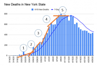
This is deaths / day but if a certain fraction of all new cases each day die a certain number of days later then you would expect deaths/day to follow new cases / day but with some delay (and it will be more diffuse since not everyone dies the exact same number of days later as IP was saying). In this plot you can see that new deaths / day is increasing through all of the zones labeled 1 through 4 before leveling out in zone 5. But, we see behavior in the slopes of each red line. From 1 to 2 to 3, the slopes are increasing. Because the slope is getting bigger each day, this means the second derivative is positive. However, from 3 to 4 to 5, the second derivative becomes negative as you can see because the slope of deaths/day gets flatter and flatter. So a transition occurs in zone 3. This is the "inflection point", where although the new deaths/day is still growing, the slope of the second derivative changes form positive to negative - or said another way, new deaths/day is still growing but it is growing more slowly.

The point where the new deaths / day reaches its peak is zone 5. This is what the author of that post was looking at. However, I am more interested in the peak of the slope of new deaths/day (zone 3). It is at this point that something has happened to make new deaths / day start growing more slowly.

The doubling time is inversely proportional to the contact rate. So when you decrease contact, you increase the time it takes to double cases. If you look in that mobility plot, contact rate started moving down on the 12th and continued to to fall until reaching a fairly constant value around March 22nd. So, let's say after a few days we moved the contact rate down so that we were only doubling once every 5 days. In this case, instead of growing from day 0 to day 3 as 100, 126, 159, 200 (doubling time 3 days) - we are now growing days 3 to 6 as 200, 230, 264, and 303. So, we haven't doubled in three days like we did from 100 to 200. The new cases/day grew by 30, 34, and 39. So from day 2 to day 3, the growth in new cases/day (from 159 to 200) was 41; however, it dropped to 30 from day 3 to 4. And if you kept driving the doubling time up (slower growth) by decreasing mobility/contact, then you'd see that change in new cases/day getting smaller and smaller. Thus, we go from one exponential growth of the virus during normal contact where the new cases/day is growing and with a positive second derivative (zones 1 through 3). Then, we start driving down contact and we see the inflection point and now although new cases/day is still growing it is growing more slowly each day (moved from positive second derivative to negative second derivative at the inflection point).

So, that describes how you start seeing inflection (you can also see inflection due to two other factors: the first is that people are healing and no longer spreading each day as well and for a given R above 1 (the number of people on average that 1 person infects) then new cases/day will grow until plateauing when new cases/day equal healing per day - at this point active cases reaches a peak but plateaus and will plateau slowly fall, the reason for this is the second reason you a decrease in new cases/day, that is enough people get infected and build immunity that the active fraction of infected people just can't be that high.) However, if you drive down R below 1, then new cases/day will peak and fall all the way to zero if you maintain R below one. The deaths/day curve above shows something a little different, where it peaks and then drops but then plateaus. If this continues, then I think it is more of an effect of populations that aren't mixing with each other. Some have dropped to R less than 1 and others haven't. But, I need to think more about that.

Anyway, back to the inflection point. So it isn't the peak in new deaths/day that I would use as the metric for when social distancing should have an impact. The peak represents the point where the R of the population (or of some populations that don't contact each other much within a bigger grouping) drops below 1. In this instance, active cases fall and that means new cases/day falls (again, if you wait long enough, it will peak even with an R greater than one and that is caused by the herd immunity effect beginning to build in but not being complete - it is possible that the peak in new york was only impacted a little by mobility and that this herd immunity effect played a strong role; however, given how high we think R is, the timing of the peak, and the antibody test results, I think that is quite unlikely). Instead, I'm interested in the inflection point.

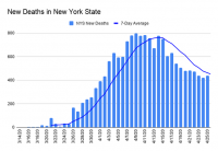
I'll repost a clean version of the deaths/day curve.

New_Deaths_in_New_York_State__ozJf.2e16d0ba.fill-634x435.png

While the peak was near April 10th, it looks to my eye like the inflection point is closer to April 3rd. By the 12th, we had gone through a peak. So that is a window of interest. If we use the same metric of 5 days on average of incubation and 15 days until death to evaluate this, then that means something impacted the growth rate of new cases/day around 20 days prior to April 3rd - which would be around March 14th. And, it looks like the R, at least for many areas, was driven below 0 by 20 days prior to April 12th, or on or before March 23rd.

Now if we go look at the mobility data, New York state started meaningful changing their mobility (and thus contact and R) on March 12th. By the 22nd it looks like we had reached the new normal for mobility in New York. So, to me this death curve actually looks fairly consistent with the mobility/contact data.

Yes, this was over a week before the "safer at home" policies; however, mobility data clearly was moving before that. I do believe that the "safer at home" policies help you drive mobility and R lower. But, people were taking actions before being mandated. I know I was working from home and not going out of the house other than a grocery run a time or two about a full week before official policies were laid out.

And, you see this in other states. Some make a case that social distancing don't make a difference because the states that don't have them are doing better than other states. Of course 1) these states are generally some of the least populated, and 2) you can look at their mobility data on unacast - without an policies they dropped their mobility to almost the same level as other states. So, yes, perhaps that means you don't need actual policies, which honestly would be a great thing. Would make me very proud of our country. Though you might need them to drive it very low (if needed). But, regardless, it means social distancing does work, IMO (policy-mandated or self-enforced).
 
Last edited:
  • Like
Reactions: Grey_pilgrim
Okay? What's your point? Are you saying my opinion is incorrect? That's fine if it is, but why do you think "meat plants are being hit hard and not other manufacturing businesses?" That was the question I answered that no one else had in 3 pages.

Now your the third person arguing against me and all I've seen is because of illegal immigrants working there and living together under one roof.

Are there more illegal immigrants working in the meat packing plants than other manufacturing businesses?
I wasn't arguing with you... Calm your tatas.

My point was that although a meat plant is an awful place to work, they aren't as gross and disgusting to be in as people intuitively think they are. That's it.
 
  • Like
Reactions: 0nelilreb
I wasn't arguing with you... Calm your tatas.

My point was that although a meat plant is an awful place to work, they aren't as gross and disgusting to be in as people intuitively think they are. That's it.
My tatas are just fine thank you very much. Lol, I didn't say they were gross and disgusting, I just said they deal in raw animal meat and blood and you don't see that kind of stuff at Caterpillar.
 
  • Like
Reactions: Grey_pilgrim
If you let the virus just keep running in exponential mode, you keep doubling about every 3 days until you reach peak active cases and then you start falling off - that peak is related to the R0. So if R0 is around 2.5 (this roughly corresponds to doubling every 3 days), you'd expect to peak in active cases when you reach about 40% of the population without infection (or 60% infected). This comes from simple SIR viral models, so isn't exact, but gives a measure of how her immunity progresses.

So, the question is can we see the effects of our social distancing efforts? Can we see that we slow the spread? What follows is a lengthy post. Lots of math. I wrote this on another board to counter an argument made by someone who claimed that the peak New York deaths came too early for the lockdown to be the reason. So you'll see me referring to "the author" below. I just wanted to clarify that's what I meant by "the author" when I refer to his argument.

--------------------------------

The executive summary of the long piece below is this: Slowing the spread doesn't mean new cases/day don't continue rising (and thus new deaths per day). In exponential growth, the change in new cases/day from day 2 to day 3 is bigger than the change from day 1 to day 2. It is running away. In the post below I lay out how you can see the change in New York mobility/contact is well-correlated to when we started seeing the change in new deaths/day trajectory. Note that the author of the original piece assumed 5 days of incubation (this is a good assumption and is the accepted median incubation time) and about 15 days between becoming symptomatic and death (also doesn't seem to be a bad assumption - I've seen 15-17 days in several studies).

------------------------------------------------------

If we go look at New York data, you can see the impacts of social distancing. First, I think that using the lockdown date is not a good approximation of when what causes a change in the rate of spread. You are really looking for where behavior started changing that might affect the new cases/day. And while a lockdown might be necessary to drive contact to an even lower value, Americans' behavior started changing before lockdowns began (for reference, the first full day of the NY Safer at Home Pause was March 23).

For example, here is NY mobility data (from unacast, using cell phone data):

View attachment 275690

We can see the first day that we saw a big drop in the mobility was March 12th (this is quite consistent across the country...it was when a lot of cancellations happened in sports and people really started changing behavior. This was the week that the headlines out of Italy started sounding very bad.

When you drop contact, it doesn't mean less people are infected the next day. With constant exponential growth the doubling time is reduced by contact but the new cases each day can still grow. For example if you have 100 cases and you are doubling every 3 days, you would be at 200 three days later. The new cases each day is higher than the last. For example, you would go from 100 on day 0, to 126 on day 1, to 159 on day 2, to 200 on day 3. New cas es per day are 26, 33, and 41. That's the first derivative of the cases/day curve. And it is increasing every day. This is what defines an epidemic. We can also look at how fast this slope is changing. In this case from day 1 to 2 to 3 the change in the change in cases/day is 6.6, 8.5, and 10.7. So the change in that slope is growing. This is the phase before we "bend the curve" (not the log curve - the normal plot of cases/day vs. time). This is the time when the difference between acting today vs. a few days from now makes a huge difference because you are really exploding.

Graphically you can see that below:

View attachment 275691

This is deaths / day but if a certain fraction of all new cases each day die a certain number of days later then you would expect deaths/day to follow new cases / day but with some delay (and it will be more diffuse since not everyone dies the exact same number of days later as IP was saying). In this plot you can see that new deaths / day is increasing through all of the zones labeled 1 through 4 before leveling out in zone 5. But, we see behavior in the slopes of each red line. From 1 to 2 to 3, the slopes are increasing. Because the slope is getting bigger each day, this means the second derivative is positive. However, from 3 to 4 to 5, the second derivative becomes negative as you can see because the slope of deaths/day gets flatter and flatter. So a transition occurs in zone 3. This is the "inflection point", where although the new deaths/day is still growing, the slope of the second derivative changes form positive to negative - or said another way, new deaths/day is still growing but it is growing more slowly.

The point where the new deaths / day reaches its peak is zone 5. This is what the author of that post was looking at. However, I am more interested in the peak of the slope of new deaths/day (zone 3). It is at this point that something has happened to make new deaths / day start growing more slowly.

The doubling time is inversely proportional to the contact rate. So when you decrease contact, you increase the time it takes to double cases. If you look in that mobility plot, contact rate started moving down on the 12th and continued to to fall until reaching a fairly constant value around March 22nd. So, let's say after a few days we moved the contact rate down so that we were only doubling once every 5 days. In this case, instead of growing from day 0 to day 3 as 100, 126, 159, 200 (doubling time 3 days) - we are now growing days 3 to 6 as 200, 230, 264, and 303. So, we haven't doubled in three days like we did from 100 to 200. The new cases/day grew by 30, 34, and 39. So from day 2 to day 3, the growth in new cases/day (from 159 to 200) was 41; however, it dropped to 30 from day 3 to 4. And if you kept driving the doubling time up (slower growth) by decreasing mobility/contact, then you'd see that change in new cases/day getting smaller and smaller. Thus, we go from one exponential growth of the virus during normal contact where the new cases/day is growing and with a positive second derivative (zones 1 through 3). Then, we start driving down contact and we see the inflection point and now although new cases/day is still growing it is growing more slowly each day (moved from positive second derivative to negative second derivative at the inflection point).

So, that describes how you start seeing inflection (you can also see inflection due to two other factors: the first is that people are healing and no longer spreading each day as well and for a given R above 1 (the number of people on average that 1 person infects) then new cases/day will grow until plateauing when new cases/day equal healing per day - at this point active cases reaches a peak but plateaus and will plateau slowly fall, the reason for this is the second reason you a decrease in new cases/day, that is enough people get infected and build immunity that the active fraction of infected people just can't be that high.) However, if you drive down R below 1, then new cases/day will peak and fall all the way to zero if you maintain R below one. The deaths/day curve above shows something a little different, where it peaks and then drops but then plateaus. If this continues, then I think it is more of an effect of populations that aren't mixing with each other. Some have dropped to R less than 1 and others haven't. But, I need to think more about that.

Anyway, back to the inflection point. So it isn't the peak in new deaths/day that I would use as the metric for when social distancing should have an impact. The peak represents the point where the R of the population (or of some populations that don't contact each other much within a bigger grouping) drops below 1. In this instance, active cases fall and that means new cases/day falls (again, if you wait long enough, it will peak even with an R greater than one and that is caused by the herd immunity effect beginning to build in but not being complete - it is possible that the peak in new york was only impacted a little by mobility and that this herd immunity effect played a strong role; however, given how high we think R is, the timing of the peak, and the antibody test results, I think that is quite unlikely). Instead, I'm interested in the inflection point.

I'll repost a clean version of the deaths/day curve.

View attachment 275693

While the peak was near April 10th, it looks to my eye like the inflection point is closer to April 3rd. By the 12th, we had gone through a peak. So that is a window of interest. If we use the same metric of 5 days on average of incubation and 15 days until death to evaluate this, then that means something impacted the growth rate of new cases/day around 20 days prior to April 3rd - which would be around March 14th. And, it looks like the R, at least for many areas, was driven below 0 by 20 days prior to April 12th, or on or before March 23rd.

Now if we go look at the mobility data, New York state started meaningful changing their mobility (and thus contact and R) on March 12th. By the 22nd it looks like we had reached the new normal for mobility in New York. So, to me this death curve actually looks fairly consistent with the mobility/contact data.

Yes, this was over a week before the "safer at home" policies; however, mobility data clearly was moving before that. I do believe that the "safer at home" policies help you drive mobility and R lower. But, people were taking actions before being mandated. I know I was working from home and not going out of the house other than a grocery run a time or two about a full week before official policies were laid out.

And, you see this in other states. Some make a case that social distancing don't make a difference because the states that don't have them are doing better than other states. Of course 1) these states are generally some of the least populated, and 2) you can look at their mobility data on unacast - without an policies they dropped their mobility to almost the same level as other states. So, yes, perhaps that means you don't need actual policies, which honestly would be a great thing. Would make me very proud of our country. Though you might need them to drive it very low (if needed). But, regardless, it means social distancing does work, IMO (policy-mandated or self-enforced).

so........ How many lives will have been saved by locking the country down? Surely their is a quantitative answer to this.
 
My tatas are just fine thank you very much. Lol, I didn't say they were gross and disgusting, I just said they deal in raw animal meat and blood and you don't see that kind of stuff at Caterpillar.
I think the workforce at Caterpillar, an auto manufacturer, and even a packaged food manufacturer differs from a meat plant. The most difficult places to work in any industry tend to attract the most needy workers. I think that means often your middle class Midwestern guy works at Caterpillar instead of the meat plant. Your immigrant population can't be that picky, and truth be told, they adapt better to that environment because of their toughness (in my opinion). That also leaves them lower paid, living in more dense conditions, and congregating in a very set community. That seems to be the perfect atmosphere for this virus.
 
They had a reason and means to be tested? Also, I dont know that the illegal part is true or even matters.

Of course it matters. Seriously? I mean, isn't that what your whole argument is based on?

The meat packing plant has been hit harder with the corona virus than other manufacturing businesses because.... The living arrangements and outside of work activities of the illegal Mexicans working there. Whole bunch of'um live under the same roof in tight dense areas. Is that not basically what you think?
 
so........ How many lives will have been saved by locking the country down? Surely their is a quantitative answer to this.

I haven't seen it. And I'm pretty sure I'm not the right person to do such an analysis.

I think the important thing to note is that an analysis that just assumes that the virus kept doubling every 3 days and then takes it from there to say this many lives would be gone now is probably not the right analysis.

When 1000+ people a day are dying in New York city of CV, folks will notice that. When hundreds a day are dying in cities all across the country, folks will take notice. My point is that people will social distance without edict. The issue is that the event to signal timing is very slow with this virus. So before you get that signal, it is already 3 times worse than you realize.
 
  • Like
Reactions: Grey_pilgrim
I think the workforce at Caterpillar, an auto manufacturer, and even a packaged food manufacturer differs from a meat plant. The most difficult places to work in any industry tend to attract the most needy workers. I think that means often your middle class Midwestern guy works at Caterpillar instead of the meat plant. Your immigrant population can't be that picky, and truth be told, they adapt better to that environment because of their toughness (in my opinion). That also leaves them lower paid, living in more dense conditions, and congregating in a very set community. That seems to be the perfect atmosphere for this virus.

Imma let my wife read this. She's a chupacabra. She'll get a kick out of it. Lol.
 
Of course it matters. Seriously? I mean, isn't that what your whole argument is based on?

The meat packing plant has been hit harder with the corona virus than other manufacturing businesses because.... The living arrangements and outside of work activities of the illegal Mexicans working there. Whole bunch of'um live under the same roof in tight dense areas. Is that not basically what you think?
No. Legal immigrants are just as likely (or more likely as these companies would not knowingly break the law by hiring illegal immigrants) to work there and live in the same housing and community conditions.
 

VN Store


Back
Top