Uniform/Helmet/Shoe design thread (merged)

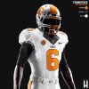
I like the matching helmets, but not the grey outline on the Orange or White Jerseys. Adidas got that right in 2013, Nike should do the same.

I agree with the no outline of the Adidas uniforms. If Nike goes with an outline, I think it needs to be consistent on the jersey, pants and even the helmet. Always thought the jersey alone outlined looked sort of strange.
 
  • Like
Reactions: 1 person
  • Like
Reactions: 1 person
VOLStormTrooper_zpskxfrecod.jpg
 
  • Like
Reactions: 1 person
Hmmm... if you're looking at chrome and thinking it looks like ****, you might need to give a little attention to personal appearance.

Cool. I was just messing with the guy. I just prefer a more traditional look.
 
Last edited:
Cool. I was just messing with the guy. I just prefer a more traditional look.

Yeah, I was just making a joke involving the reflective properties of chrome. Okay, so the joke was a bit obscure, I'll admit.

Fwiw, me no likey the chrome either. Garish imo.
 
So, wake forest is going to suck on the field and look bad while doing it.

Those striped shoulders are horrible.
 
So, wake forest is going to suck on the field and look bad while doing it.

Those striped shoulders are horrible.

Shoulder patterns have become Nike's thing, see Kentucky, FSU, Baylor, etc. Even if they're subtle or the same color as the jersey, they've become a fairly regular design element.
 
Shoulder patterns have become Nike's thing, see Kentucky, FSU, Baylor, etc. Even if they're subtle or the same color as the jersey, they've become a fairly regular design element.

Take those checkerboard shoulders off Kentucky's uniform and put it on ours and I'm down.
 

VN Store


Back
Top