Vol uniform/helmet design discussion (merged)

Status
Not open for further replies.
Silver helmet with mat black T with all white Uni with Mat black numbers.

For one game......would look sick. I say we wear it for the oregon game. (Show them Tennessee Swagger)
 
Last edited:
They have been changed before. The shape of the T has evolved over time. Fulmer went with a wider orange stripe, which I like alot. The face masks were changed from gray to white. I think I would have to see it up close to decide. There is nothing in the picture that could not be changed back in a couple of minutes.
 
I'd like to see the helmet remain fundamentally the same. Certainly without the zipper look in the center. But perhaps checkerboarding the Power T.
 

Attachments

  • PowerT2.gif
    PowerT2.gif
    32 KB · Views: 15
I think helmet designs should be culturally appropriate. Ours should have flames on the front, some random swirly pinstriping on the back, a couple odd spots of bad-bondo waviness and one whole section that is just primer. And maybe green lights in the earholes.
 
  • Like
Reactions: 1 person
I think helmet designs should be culturally appropriate. Ours should have flames on the front, some random swirly pinstriping on the back, a couple odd spots of bad-bondo waviness and one whole section that is just primer. And maybe green lights in the earholes.

that would be so sick. It would totally "sell" the program with the recruits.
 
I think helmet designs should be culturally appropriate. Ours should have flames on the front, some random swirly pinstriping on the back, a couple odd spots of bad-bondo waviness and one whole section that is just primer. And maybe green lights in the earholes.

Why not plaster a bunch of decals ala NASCAR?
 
Eh, got to tinkering around and figured I'd toss these out there for shiggles. I can alter anything if anyone is curious to see something. After playing with this and all, I see how Oregon ends up with 1000 variations.
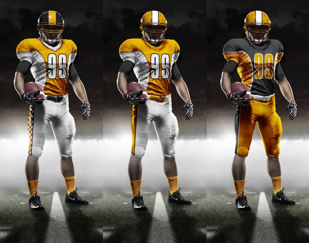
VolUniformOptionsSet1_zpsa960ff84.jpg
 
Eh, got to tinkering around and figured I'd toss these out there for shiggles. I can alter anything if anyone is curious to see something. After playing with this and all, I see how Oregon ends up with 1000 variations.

VolUniformOptionsSet1_zpsa960ff84.jpg


Yea...try the one on the left with "Black Pants" but keep the checkerboard stripe on the side and orange shirt. I like that.
 
I think helmet designs should be culturally appropriate. Ours should have flames on the front, some random swirly pinstriping on the back, a couple odd spots of bad-bondo waviness and one whole section that is just primer. And maybe green lights in the earholes.

Now you are sounding eerily similar to my major professor, a cultural anthropologist at UT, who once described Tennessee as the "Camaro capitol of the world."
 
Status
Not open for further replies.

VN Store


Back
Top